Technical Analysis Using Multiple Timeframes
When trading the financial markets, timing is everything and understanding how the market moves is the difference between success and failure. Technical analysis is a method of analyzing financial markets using charts and other technical indicators. It is by far the most effective tool for traders available today. And with the rise of artificial intelligence and big data processing, technical analysis will enter a new phase soon, further enhancing its efficacy and capabilities.
You’ve probably heard the saying, “A picture is worth a thousand words,” right? Think of a chart filled with candlesticks and technical indicators as a painted landscape of the market. That’s technical analysis in a nutshell – transforming raw market data into visual narratives. Technical analysis is all about studying patterns in historical market data, in order to find repeatable trends to predict the future price.
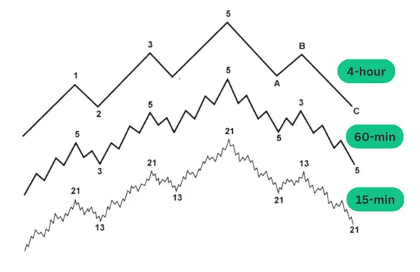
Now, let’s add another layer to technical analysis, one that most professional traders use in their trading: multiple timeframe analysis. Going from the context above, picture yourself looking at that landscape through different zoomed lenses, where each lens represents a certain timeframe. What seems like a storm in a 5-minute chart might look like a mere ripple in a daily or weekly perspective. Multiple timeframe allows us to better visualize and put into context the conflicting messages the market is displaying to us.
The goal of this article is to show you how to use multiple timeframes in your trading to avoid fake signals, navigate through market noise and pinpoint trade entries and exits with high accuracy. And at the end we will also discuss a very important aspect that will make or break your edge in the market: risk management—the cornerstone of sustainable success in trading. Something that beginners often get to learn the hard way by liquidating their trading account in just a few trades.
Before we dive into technical analysis, price charts and timeframes, it is necessary to understand the cyclical flow of capital in the market. Just like the economic cycle that moves through the stages of expansion, peak, decline, and recovery, financial market cycles follow a similar pattern, divided into four distinct phases. This idea of analyzing market cycles by breaking them down into stages was introduced by Stan Weinstein in his book, “Secrets for Profiting in Bull and Bear Markets.”
What Are the Four Market Cycles?
Emotions play an important part in the cyclical nature of the markets. Fear, greed, euphoria, panic—they are all rooted into the very fabric of market cycles. By recognizing these emotional states, you will be better able to interpret market signals and adapt to changing trends. It’s like deciphering the emotional pulse of the market. Every successful trader knows how to read these emotions and act on them, so consider this a priority in your learning process.
Accumulation Phase: Think of this phase as the calm before the storm. It's a time when smart money—institutions and savvy investors—starts to buy into the market. At this stage there is not much public interest in entering the market and price volatility is relatively low. It often occurs at the market bottom and range trading is the most common strategy used in the accumulation phase.
Markup Phase: This is where the action begins to heat up. The market is not consolidating anymore and starts to trend upwards. Public interest grows so more participants jump on the bandwagon. Trend trading and “buying the dip” are the most common strategies in the markup phase. This phase is a golden opportunity for traders who recognize the signs early, as it can result in massive gains for those who catch the wave from the beginning.
Distribution Phase: As the saying goes, “What goes up must come down.” The distribution phase is marked by a slow and gradual selling by institutional investors. They begin to unload their positions and rip the rewards. The buying power is being exhausted and now the bull market starts to show signs of weakness.
Markdown Phase: The last stage of the cycle is a downward trend. This phase can be as profitable as the markup stage for those who know how to short sell or exit their positions in time. However, you will notice that often the participants’ behavior in the markdown phase is different from the markup phase. Typically, in a downtrend, panic selling often leads to a more sudden decline in prices, whereas in an uptrend, prices tend to rise steadily and at a more gradual pace.
How to Apply Technical Analysis Using Multiple Timeframes
In this section we will go through the process of analyzing multiple timeframes and how to bring more clarity to your trading decisions. Let’s break down the process into steps that can be easily followed, and see how multiple timeframe analysis can be used to your advantage. Then at the end of the section we will go through some live examples of how this methodology functions in a real-time analysis.
- Choosing Timeframes: The first step is to select the appropriate timeframes. The best approach is to use a combination of long, medium, and short-term charts. For instance, you may use a weekly chart to understand the long-term trend, a daily chart for medium-term insight, and a 1-hour chart for short-term analysis. Each one will tell a different part of the story and when all stories align, that’s when you pull the trigger.
- Analyzing the Long-Term Trend: The longest timeframe will tell you what is the overall direction of the market and where are the key support and resistance levels. The most common timeframes for long-term analysis are weekly or daily charts.
Based on this information, you will know approximately which trading strategy is best suited in the lower timeframes when deciding to enter the market. For example, if the market is trending upwards and it’s in a retracement phase, the best approach would be to apply a retracement breakout strategy.
- Investigating the Medium-Term Perspective: The medium-term view is all about validating the long-term trend. The most common timeframes are the daily, 4-hour or 1-hour charts. Here, you need to look for chart patterns such as head and shoulders or technical indicators that signal a continuation or reversal of the long-term trend.
For instance, if the long-term timeframe is indicating a clear upward trend, but in the medium-term view you observe a pattern of lower lows and higher lows (which indicates a downtrend), be careful. It may not be a good idea to enter a trade at that moment, as the conflicting information suggests an inconclusive market direction.
- Pull the Trigger with Short-Term Analysis: Finally, the short-term timeframe is the lens for finding your entry and exit points. This timeframe requires the most attention and is the most challenging to master because there is much more market noise. The ideal timeframes for the short-term analysis vary from 1-hour, 15-minutes to 5-minute.
One of the golden rules of multiple timeframe analysis is: always align across timeframes. Make sure that the signals you identify are consistent across the timeframes. You need to observe the same story on all different timeframes. If there are conflicting signals, it may be best to stand aside until a clearer picture emerges. Alignment across timeframes will help you in filtering out false signals which will result in less bad trading decisions.
This being said, let’s now look at some live examples with technical analysis using multiple timeframes in action.
Trading Bitcoin Using Multiple Timeframe Analysis (Example 1)
In this example we are looking at Bitcoin’s price from January 2023 until June 20, 2023. In this period BTC is showing clear signs of a bull run, forming lower highs and higher highs. Let’s get a more detailed view to decide if and when we should go long on BTC based on a multi-timeframe analysis approach.
The Long-Term Perspective on the Daily Chart
First, we look at the daily chart to understand in which market cycle BTC is trending and what is the overall direction of the price.
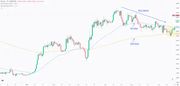
Observations:
- The 50-period exponential moving average (EMA) crossed above the 200-period EMA in the beginning of March 2023 and has maintained its position above so far. This indicates that a long-term bullish trend may start developing.
- Based on the market cycles described above in the article, we could be in the beginning of a markup phase. We are only interested in buying right now and now we have to make sure this “story” aligns with the other timeframes as well.
- Despite the overall upward trajectory of the price, there has been a pullback (or retracement) to the 200-period EMA. This level often acts as a significant support zone. In a strong trending market, prices often rebound once they reach the 200 EMA level.
Next, we will look into the medium-term timeframe and try to find additional confirmation of a buy signal. We are going to focus on analyzing the most recent price developments which are highlighted in yellow.
The Medium-Term Perspective on the 1-hour Chart
Zooming into the 1-hour chart, we’re looking for signals that indicate the pullback is ending and the price is reverting to its main upward trajectory, aligning with the narrative of the daily chart.
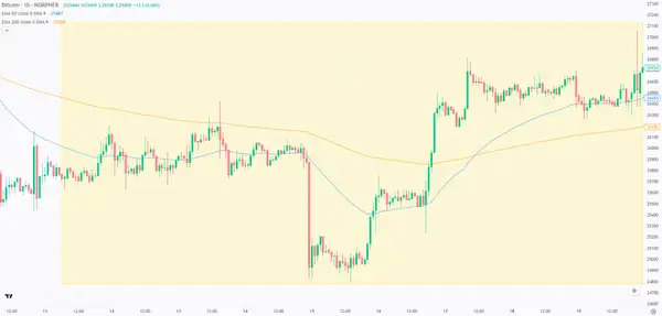
Observations:
- On June 17, 2023, the 50-period EMA crossed above the 200-period EMA, indicating that the pullback is over.
- The story aligns perfectly with the higher timeframe confirming further the upward trend.
Next, we are switching lenses to the short-term view to find entry and exit points into the market.
The Short-Term Perspective on the 15-minutes Chart
Now the real action begins. In the short-term timeframe, the goal is to find the right time to decide when to pull the trigger. There are many different ways to pinpoint market entries and exits. We are not going to cover them in this article here is a list of the most common strategies that traders use at this stage:
- Breakouts
- Trendlines
- Fibonacci retracement
- Candlestick patterns
- Support and resistance
Now let’s look at the 15-minute chart and find the best entry point for a BTC long trade.
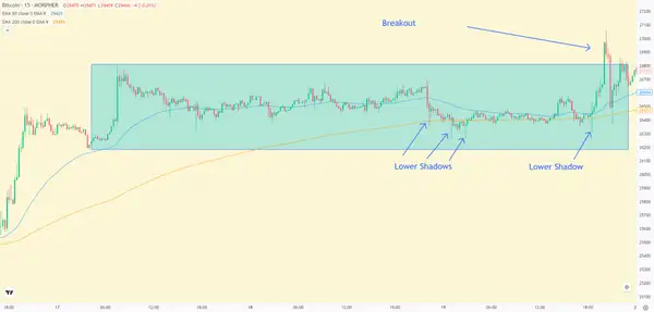
Observations:
- The story aligns with the other 2 timeframes. The 50-period EMA is above the 200-period EMA and this is exactly what we are looking for.
- The price is in a consolidation phase, and several prominent long lower wicks are evident in this range. Such wicks signify notable price rejection; in this scenario, it suggests that while bears attempt to drive the price down, they lack momentum. The bulls hold the dominant strength.
- There is a good entry option at the channel breakout when the first green candlestick closes above the channel. This is a more aggressive entry option. If you are trading more on the conservative side, you can wait for a bullish candlestick pattern to form or use another set of indicators to confirm the channel breakout.
In our example, our analysis and prediction were spot on! The market went into a massive bull run and this trade had the perfect entry.
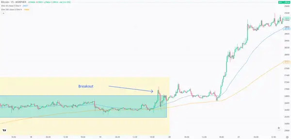
Multi-timeframe analysis helps in making better decisions by looking at the bigger picture and fine-tuning entries/exits, but it doesn't guarantee success. Even when you follow the rules by the book, some trades will inevitably be losses—it's the nature of trading. That’s why it is so important to consider using risk management techniques such as stop-loss orders and position sizing.
Trading Tesla Using Multiple Timeframe Analysis (Example 2)
In this next example we’ll analyze TSLA stock and try to pinpoint a potential entry point during the February/March 2023 window. We will apply the same methodology as in the previous example by analyzing the trend with the daily chart, seek confirmation on the 1-hour timeframe and zoom in to the 15-minute chart to find an optimal point to enter the market.
The Daily Chart View
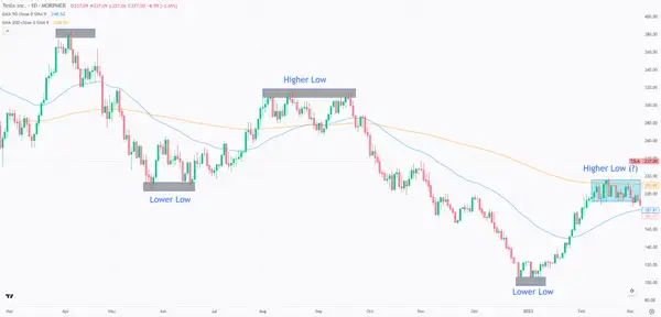
Observations:
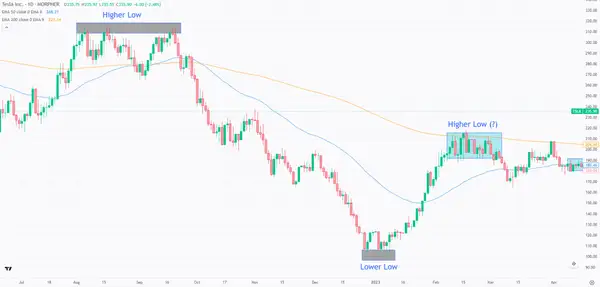
- The 50-period EMA is below the 200-period EMA, indicating a downward trend.
- Regarding the market cycle, TSLA is in a clear markdown phase. The higher lows and lower lows patterns show clearly that TSLA price is falling.
- In a markdown market cycle we are only interested in short selling the market. We follow the “trend is your friend” approach.
- The (blue) highlighted section on the chart appears to be a price consolidation. When price is consolidating, it is best to stay on the sidelines and wait for a breakout. The highlighted period starts from February 7, 2023 until March 7, 2023.
Now we are going to zoom in and look at the 1-hour chart to confirm the downtrend development.
The 1-hour Chart View
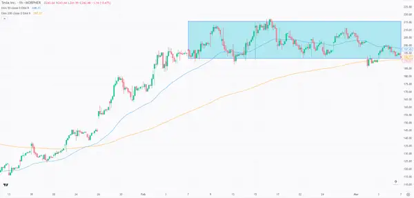
Observations:
- The 1-hour chart is painting a different picture than the daily chart. The 50-period EMA is above the 200-period EMA, which indicates a bullish trend.
- There are 2 scenarios that can develop now. We’re either witnessing a pullback nearing its end, or the price will continue rising and trigger an uptrend.
- The best thing to do now is to wait for the prices to develop further until we have an agreement of direction on both timeframes (daily and 1-hour), before we zoom in further to the 15-minutes chart.
Fast forward to April 10, 2023, the 50-period EMA crossed below the 200-period EMA and now we have an agreement on price direction from both the hourly and daily chart.
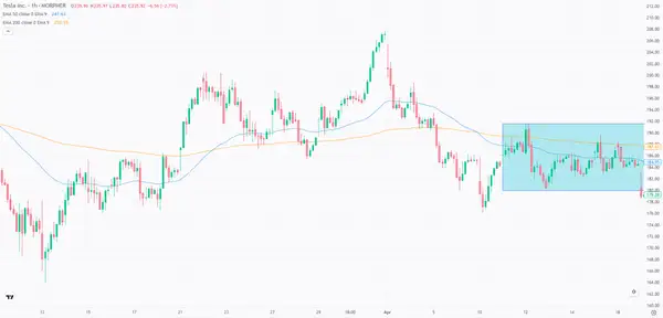
Now it’s time to switch to the 15-minutes chart and find out when it’s the right time to short sell TSLA. Let’s go!
The 15-minutes Chart View
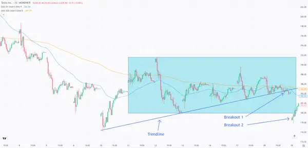
Observations:
- The 50-period EMA is below the 200-period EMA, so the narrative aligns perfectly with the hourly and daily chart.
- The price is undergoing a consolidation phase, and there is some kind of panic selling happening. The red candles are dominating the consolidation channel on the chart.
- A good entry point here is when the price breaks from the consolidation channel (Breakout 2), OR when the first candlestick body closes below the trendline (Breakout 1).
- An ideal entry point would be either when the price breaks the consolidation channel (Breakout 2) or when the first candlestick’s body closes below the trendline (Breakout 1).
In this second example, our analysis was more intricate and we had to wait a longer period of time to find the optimal setup. It happens often that the narratives between the 3 timeframes don’t align, so it’s very important to have patience and wait. Sometimes it can take even a week to find a good opportunity. Take your time, don’t rush into the market and you will win.
Let’s take a look at what happened following our TLSA short sell signal.
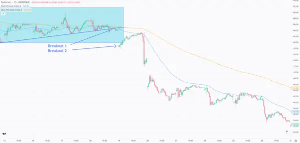
Once again, we nailed our multiple timeframe analysis and scored another win. But again, this method will not win 100% of the time. Trading always carries a certain level of risk, and it's crucial to be prepared for potential setbacks. Now you can add this method of multiple timeframe analysis to your trading arsenal and improve your edge in the markets.
One last thing before we conclude this guide: risk management. You can have the best trading setup in the world, but without a sound risk management strategy, you are bound to fail.
Build a Solid Risk Management Strategy and Stick To It
Risk management is the safety seatbelt of a trader's journey in the market. It's what separates the seasoned professionals from the short-lived amateurs. It's not just about maximizing profits, but also about minimizing losses.
- Position Sizing: This is perhaps the most basic yet pivotal aspect of risk management. The size of your trade should always be proportionate to the capital you have. If you're risking a large chunk of your capital on a single trade, a few consecutive losses can decimate your account. For instance, a common rule of thumb is to risk no more than 1-2% of your trading capital on any given trade. If you have a $10,000 account, this means you shouldn't stand to lose more than $100 to $200 on a single trade.
- Stop-Loss Orders: An integral part of trading, a stop-loss order is set at a predetermined price level. If the market moves against your position, the trade will automatically close once it hits this price, ensuring that you don’t lose more than you're willing to risk. For example, if you buy a stock at $50 expecting it to rise, you might set a stop-loss at $48. This means if the stock price falls to $48, your position will be automatically closed, limiting your loss.
- Take-Profit Orders: While stop-loss orders protect the downside, take-profit orders secure the upside. If you've set a target for a particular trade and it hits that mark, a take-profit order ensures you book those profits before market conditions reverse.
- Diversification: Don't put all your eggs in one basket. Traders should diversify their trades across various assets, sectors, or even trading strategies. This ensures that poor performance in one area doesn't spell disaster for the entire portfolio. For example, if you’re heavily invested in technology stocks, consider diversifying with some commodities or foreign exchange positions.
- Emotional Discipline: One of the greatest risks in trading is not the market itself but the trader's own emotions. Fear and greed are powerful drivers that can lead traders to make irrational decisions. Always make decisions based on logic and strategy, not emotions.
- Review and Adjust: After every trade, win or lose, review your decisions. Analyze what went right and what went wrong. Over time, this practice can offer invaluable insights and help refine your risk management techniques.
Conclusion
Technical analysis using multiple timeframes is a must-have strategy in your trading arsenal. By analyzing the market from different angles, you can gain deeper insights, avoid more market noise, identify more accurate entry and exit points, and mitigate false signals. And don’t forget risk management, the hidden tool that can make or break any trading strategy.

Disclaimer: All investments involve risk, and the past performance of a security, industry, sector, market, financial product, trading strategy, or individual’s trading does not guarantee future results or returns. Investors are fully responsible for any investment decisions they make. Such decisions should be based solely on an evaluation of their financial circumstances, investment objectives, risk tolerance, and liquidity needs. This post does not constitute investment advice.

Painless trading for everyone
Hundreds of markets all in one place - Apple, Bitcoin, Gold, Watches, NFTs, Sneakers and so much more.

Painless trading for everyone
Hundreds of markets all in one place - Apple, Bitcoin, Gold, Watches, NFTs, Sneakers and so much more.
