How to Read Cryptocurrency Charts
Cryptocurrency charts are essential tools that traders use to analyze market trends, identify patterns, and make informed decisions about their investments. Understanding how to interpret these charts is crucial. They help traders identify potential opportunities for profit, minimize risks, and make informed decisions about buying, selling, or holding cryptocurrencies.
Importance of Reading Charts
There are a number of reasons why reading charts is important for cryptocurrency trading.
Charts help traders analyze market trends and identify potential buying and selling opportunities. Traders can identify patterns that indicate whether a particular cryptocurrency is likely to increase or decrease in value.
Charts help identify trading entry and exit points. Traders can identify levels of support and resistance, which can help them determine when to enter or exit a trade.
By setting stop-loss orders at these identified levels, traders can minimize their losses if the price of a cryptocurrency suddenly drops.
Cryptocurrency Chart Basic Elements
A cryptocurrency chart is a graphical representation of the price movement of a particular cryptocurrency over time.
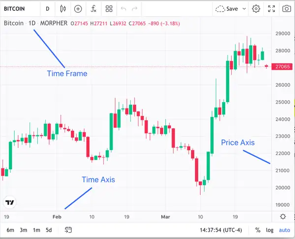
1-Day Bitcoin Candlestick Chart (source: Morpher.com)
In the Bitcoin candlestick chart reproduced above, the basic elements of a cryptocurrency chart are illustrated: the time frame, the price axis, and the time axis.
Time Frame
Candlesticks on cryptocurrency charts can be set to represent various timeframes. For example, each candlestick in the Bitcoin chart reproduced above represents one day (1D) of trading. A trader's style and strategy determine the trading period.
Price Axis
The price axis represents the crypto price being charted. It is typically represented vertically on the chart, with the price increasing as you move up the axis.
In the example above, this price axis represents the price of Bitcoin. The price axis is important because it allows traders to see Bitcoin’s actual price at different points in time, and to identify price action trends.
Time Axis
The time axis represents the chart’s time period. It is typically represented horizontally on the chart, with time increasing moving left to right along the axis. The time axis is measured in units of time, such as minutes, hours, days, or weeks.
Line Charts
Line charts are created by plotting a series of data points and then connecting them with a straight line. Each data point represents the closing price for a specific time period, such as a day, week, or month.
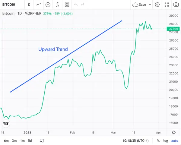
Bitcoin 1-Hour Line Chart (source: Morpher.com)
Line charts, like the Bitcoin 1-hour line chart illustrated above, are useful because they provide a clear way to analyze market trends. By looking at this line chart, traders can quickly see whether the price of Bitcoin is trending up, down, or sideways.
Bar Charts
A bar chart represents each time period with a vertical bar. The top of the bar designates the highest price during that time period and the bottom of the bar designates the lowest price.
An exemplary Bitcoin 1-hour bar chart is reproduced below.
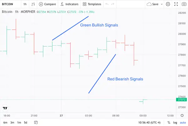
Bitcoin 1-Hour Bar Chart (source: Morpher.com)
A horizontal line is then added to the bar to show the opening and closing prices for that time period. By displaying the range of prices for each time period, bar charts show the volatility of the market.
Bar charts utilize color to represent the direction of the price movement. The bar is colored green if the closing price is higher than the opening price. The bar is colored red if the closing price is lower than the opening price.
Candlestick Charts
A candlestick chart is made up of a series of candlesticks, each representing a specific period of time (e.g., one hour, one day, or one week).
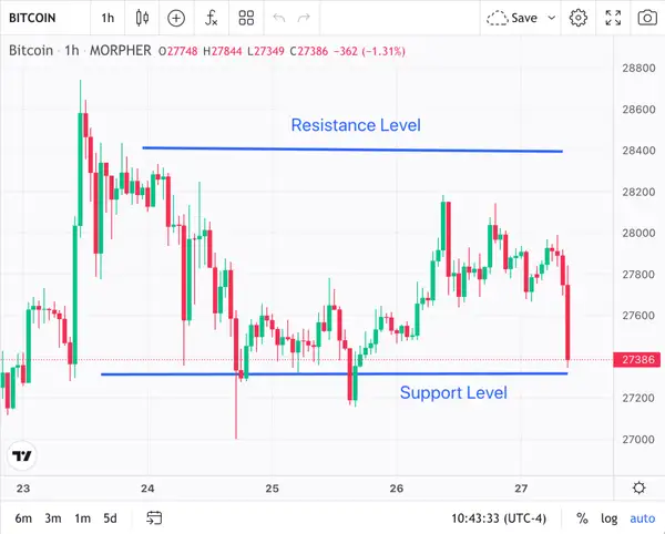
Bitcoin 1-Hour Candlestick Chart (source: Morpher.com)
The candlestick chart above represents a Bitcoin 1-hour candlestick chart.
The body of each candlestick represents the opening and closing prices for that period. The shadows (“wicks”) represent the high and low prices during that period.
The shape and color of each candlestick provide critical information. A bullish (or “green”) candlestick denotes that the closing price was higher than the opening price. A bearish (or “red”) candlestick denotes that the closing price was lower than the opening price.
Candlestick charts also reveal important patterns and trends in the market, such as support and resistance levels.
How to Read Crypto Charts
Traders use technical analysis to read crypto charts and make trading decisions. Technical analysis is the study of historical market data, such as price and volume, to identify patterns and trends that can provide insight into future price movements.
Crypto Market Cycles
There are a number of phases in a cryptocurrency market cycle. During these phases, external factors including market sentiment, global events, crypto adoption, and regulatory issues, can have an impact on price action.
Crypto market cycles include four (4) primary phases. During the initial accumulation phase, smart money investors accumulate cryptocurrency assets at low prices before a bull market starts.
A markup phase is characterized by a price action that trends upward over a period of time. This phase is characterized by a rapid increase in prices as more investors enter the market.
Stark price volatility designates the height of the markup phase and where this phase transitions to the next phase. In this phase, prices have peaked, and early investors start to sell their holdings to realize profits. Prices begin to decline amid increased volatility.
This is the final phase of the cycle, where prices have declined significantly, and most investors are bearish. This phase is characterized by a period of consolidation before a new cycle starts.
Higher-Highs / Higher-Lows
Higher-highs and higher lows are used to describe a bullish trend.
A higher-high occurs when the price of an asset reaches a peak that is higher than the previous peak during a certain time period. This denotes that there is an increase in buying pressure and demand for the asset, as more traders are willing to buy at higher prices.
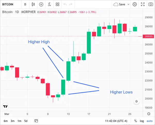
Exemplary Bitcoin Higher-Highs and Higher-Lows (source: Morpher.com)
A higher-low occurs when the price of an asset reaches a low point that is higher than the previous low during a certain time period. This denotes that buyers are still willing to step in and buy the asset, even at higher prices than before.
When a cryptocurrency chart, like the Bitcoin chart above, shows a series of higher-highs and higher-lows, it indicates that the overall trend is bullish and the price is trending upwards. This is seen as a positive sign, as it suggests that the asset is gaining strength and there is potential for further price increases.
Lower-Lows / Lower-Highs
Lower-lows refer to a pattern where the price of an asset reaches a new low point that is lower than the previous low point.
Lower-highs, on the other hand, refer to a pattern where the price of an asset reaches a new high point that is lower than the previous high point.
For example, in the chart illustrated below, Bitcoin experienced both a lower-low and a lower-high from March 8th to March 9th.
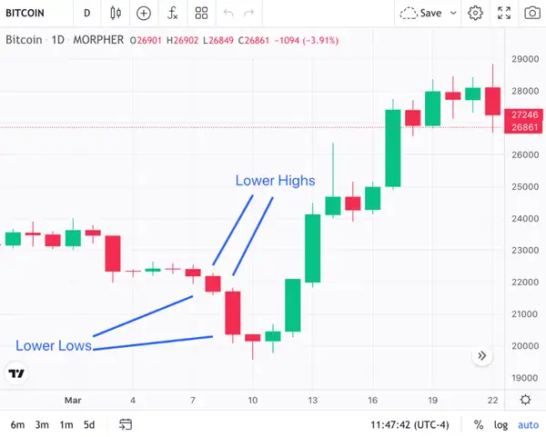
Exemplary Bitcoin Lower Highs and Lower Lows (source: Morpher.com)
With both lower-lows and lower-highs occurring, Bitcoin experienced a downtrend. This means that sellers are in control, and there is more selling pressure than buying pressure.
Candlestick Patterns
The arrangement of individual candlesticks on a chart creates candlestick patterns. Candlesticks show the open, high, low, and closing costs for a given cryptocurrency over a predefined timeframe.
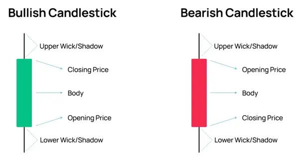
The Anatomy of a Candlestick (source: Morpher.com)
The difference between the opening price and the closing price is represented by the candlestick body, the solid portion of the candlestick. The body is colored or shaded to depict the opening and closing prices.
The thin vertical line that runs from the top and bottom of the body is referred to as the wick, or the shadow. It represents the high and low costs during a similar period.
The asset's price movement is indicated by the length and thickness of the body. A long body denotes a strong price movement, while a short body denotes a weak price movement.
The body's color can also tell you how the price is changing. Green indicates bullish movement, while red indicates bearish movement.
Identifying Trend Lines
Identifying trend lines involves looking for patterns in the price movement that show a consistent trend. Here are some steps to follow when identifying trend lines.
The first step in identifying trend lines is to determine the time frame of the chart you are analyzing. Depending on your investment goals and trading strategy, you may be looking at charts with different time frames, such as hourly, daily, or weekly charts.
Next, look for high and low points on the chart. High points are peaks where the price reached a certain level before declining, while low points are valleys where the price fell before recovering. These points can be identified using candlestick charts or line charts.
Once you have identified the high and low points, draw a line connecting the two points that show the overall trend. For example, if the price is consistently rising, draw a line connecting the low points, and if the price is consistently falling, draw a line connecting the high points.
To confirm the trend line, look for additional high and low points that fall along the same line. The more points that align with the trend line, the stronger the trend is considered to be.
After you have drawn the trend line, you can identify support and resistance levels along the line. Support levels are areas where the price tends to bounce off and rise back up, while resistance levels are areas where the price tends to bounce off and fall back down.
Analyzing Trading Volume
Analyzing trading volume is an important aspect because it can provide valuable insights into market trends and price movements. Here are some steps to follow when analyzing trading volume on a crypto chart
Trading volume represents the total amount of cryptocurrency that has been traded within a specific time period. High trading volume can indicate increased market interest and liquidity, while low trading volume can indicate decreased interest or a lack of liquidity.
Determine the time frame of the chart you are analyzing. You may be looking at charts with different time frames, such as hourly, daily, or weekly charts.
Look for trends in trading volume over time. If the trading volume is consistently high or low, this could indicate a strong trend in the market. For example, if trading volume is consistently high over a period of several days, this could indicate that there is strong buying pressure in the market, which could lead to an increase in price.
Compare trading volume to price movements on the chart. If the price is rising and trading volume is also increasing, this could indicate that the price is being driven by strong buying pressure. Conversely, if the price is falling and trading volume is also decreasing, this could indicate that the price is being driven by strong selling pressure.
Look for divergences between trading volume and price movements on the chart. For example, if the price is rising but trading volume is decreasing, this could indicate that the price increase is not sustainable and may be due for a correction.
Use technical indicators such as the On Balance Volume (OBV) or Volume Weighted Average Price (VWAP) to further analyze trading volume trends and identify potential market trends.
Identifying Support and Resistance Levels
Support and resistance levels are used to identify potential buying and selling opportunities.
Support levels refer to price points where a security's price is likely to stop falling and reverse course. They are often created when there is a large number of buyers in the market, creating a demand for the crypto at a particular price.
For example, a support level of $16,000 for Bitcoin is designated in blue in the chart reproduced below. At this support level, the price of Bitcoin has repeatedly stopped falling lower, only to bounce back with forward momentum.
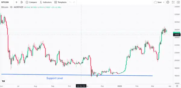
Exemplary Bitcoin Support Level (source: Morpher.com)
If a crypto's price repeatedly falls to a support level and then bounces back up, this can be interpreted as a buy signal. And this is exactly what happened when Bitcoin became bullish in the middle of January 2023.
Resistance levels are where a security's price is likely to stop rising and potentially reverse course. When sellers outnumber buyers, this creates a supply of the asset at a particular price.
For example, a Bitcoin resistance level of $25,000 is designated in blue below.
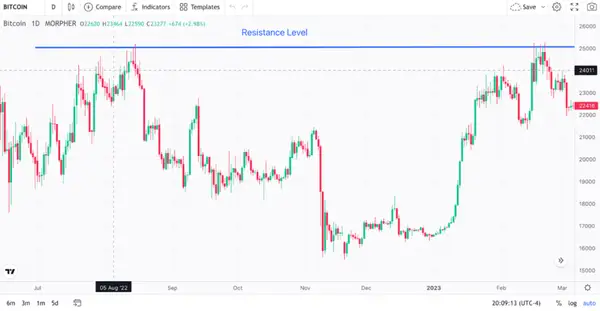
If Bitcoin's price rises to this resistance level and then fails to break through, traders may interpret this as a sell signal. And this is exactly what happened to Bitcoin as it experienced a bit of a bear market run in early March 2023.
Technical Indicators for Cryptocurrency Trading
Technical analysis is based on the idea that market trends, patterns, and behaviors can be analyzed to predict future price movements.
Moving Averages
Moving averages smooth out price fluctuations and identify trends. The Simple Moving Average (SMA) and the Exponential Moving Average (EMA) are commonly used moving averages.
A Bitcoin SMA (noted in blue) is illustrated in the chart below. Note how this SMA smooths out Bitcoin’s price fluctuations.
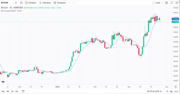
Exemplary Bitcoin Simple Moving Average (source: Morpher.com)
Relative Strength Index (RSI)
Trend analysis and technical indicators can confirm or disprove trends. As an example, the Relative Strength Index (RSI) distinguishes between overbought and oversold conditions. RSI charts use a scale from 0 to 100. If the RSI is greater than 70, it means that the crypto is overbought. An RSI value of below 30 represents an oversold situation.
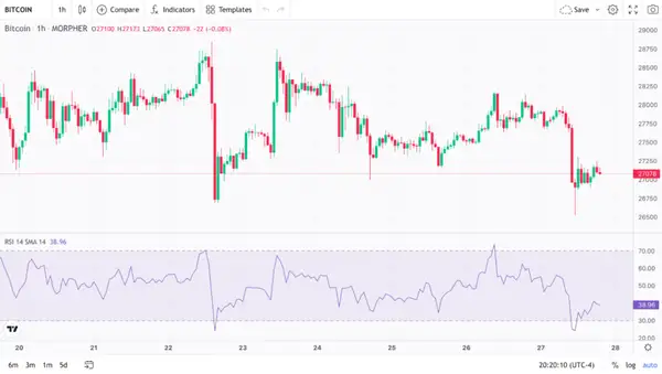
Exemplary Bitcoin RSI Chart (source: Morpher.com)
A Bitcoin five-day day RSI chart is shown above. Take note of the sharp drop in Bitcoin's RSI that coincides with the sharp drop in price, indicating that the market experienced an oversold state.
Bollinger Bands
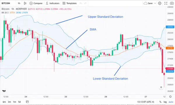
Bollinger Bands help identify the volatility and potential price movement of a security. These bands consist of three lines. The first line is a simple moving average (SMA) over a specified time period.
The second line is a standard deviation above the SMA. The third line is a standard deviation below the SMA. The standard deviation is a measure of volatility, and the number of standard deviations used can be adjusted to suit the trader's preference.
The Bollinger Bands for an exemplary Bitcoin price chart are illustrated below.
Exemplary Bitcoin Pricing Chart with Bollinger Bands (source: Morpher.com)
As illustrated above, the upper and lower blue Bollinger Bands form a channel around the SMA, which is the middle orange band. As the price of Bitcoin moves up and down, the Bollinger Bands expand and contract accordingly.
When the Bitcoin price is within the channel, it is considered to be trading in a range. When the price moves outside of the channel, it is seen as a potential trend change or a breakout.
Conclusion
Cryptocurrency charts are essential for traders who want to analyze the market trend of a particular cryptocurrency. By providing a clear and simple way to view the price movement of the cryptocurrency over time, charts help traders identify important levels of support and resistance, track long-term trends in the market, and make informed decisions about buying, selling, or holding cryptocurrencies.
Disclaimer: All investments involve risk, and the past performance of a security, industry, sector, market, financial product, trading strategy, or individual’s trading does not guarantee future results or returns. Investors are fully responsible for any investment decisions they make. Such decisions should be based solely on an evaluation of their financial circumstances, investment objectives, risk tolerance, and liquidity needs. This post does not constitute investment advice.

Painless trading for everyone
Hundreds of markets all in one place - Apple, Bitcoin, Gold, Watches, NFTs, Sneakers and so much more.

Painless trading for everyone
Hundreds of markets all in one place - Apple, Bitcoin, Gold, Watches, NFTs, Sneakers and so much more.
