How to Read the Bitcoin Chart

As a seasoned expert in the world of cryptocurrency, I am often asked how to read Bitcoin charts. Understanding these charts is crucial for any investor or enthusiast looking to navigate the turbulent waters of the crypto market. In this article, I will break down the basics of Bitcoin charts, discuss the different types, highlight key elements, and introduce you to the most commonly used indicators. Let's dive in!
Understanding the Basics of Bitcoin Chart
Before we delve into the nitty-gritty details, let's start with the fundamentals. So, what exactly is a Bitcoin chart? In simple terms, a Bitcoin chart is a graphical representation of the price movement of Bitcoin over a specific period. It helps investors analyze historical price data and identify potential trends or patterns.
Now, you may wonder why it is important to read a Bitcoin chart. Well, my friend, knowledge is power in the world of cryptocurrency. By studying these charts, you can gain insights into market sentiment, make informed investment decisions, and even potentially predict future price movements.
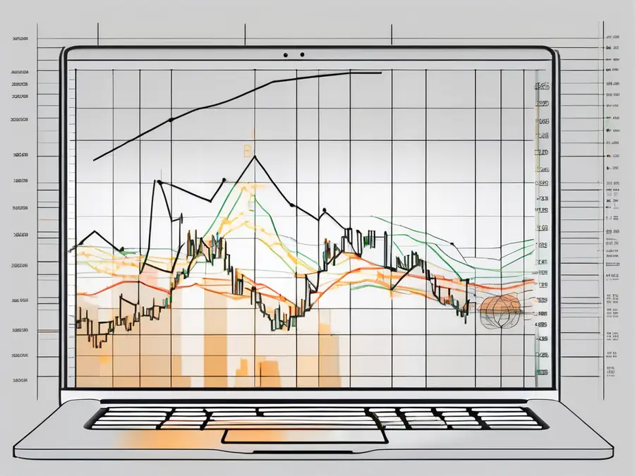
When looking at a Bitcoin chart, you will typically see a line graph that shows the price of Bitcoin over time. This visual representation allows traders and investors to track the price fluctuations of Bitcoin, which can be crucial for timing buy or sell orders. Additionally, Bitcoin charts often come with various technical indicators and overlays that can help users analyze the market more effectively.
Moreover, understanding how to read and interpret Bitcoin charts can also provide valuable information about trading volume, market liquidity, and price volatility. By observing patterns such as support and resistance levels, moving averages, and trading volumes, investors can make more informed decisions about when to enter or exit the market. In essence, mastering the art of reading Bitcoin charts is essential for anyone looking to navigate the volatile yet potentially rewarding world of cryptocurrency trading.
Types of Bitcoin Charts
Bitcoin charts come in different flavors, each offering unique ways to interpret and analyze price data. Let's take a quick look at the three most common types:
Line Charts
Line charts are the simplest form of Bitcoin charts. They display the closing prices of Bitcoin over a specific period as a continuous line. Line charts provide a clear visual representation of Bitcoin's overall price trend and are great for identifying long-term patterns.
For traders and analysts, line charts are often used as a starting point for technical analysis. By connecting the closing prices over time, patterns such as support and resistance levels can be easily identified. This can help traders make informed decisions about when to buy or sell Bitcoin based on historical price movements.
Bar Charts
Bar charts, also known as OHLC (Open-High-Low-Close) charts, provide a more detailed view of Bitcoin's price movement. Each vertical bar represents a specific time period and shows the opening price, high, low, and closing price. These charts offer valuable insights into price volatility and market fluctuations.
Traders often use bar charts to analyze the relationship between opening and closing prices within a given time frame. The length of the bars and the position of the opening and closing prices relative to each other can indicate the strength of buying or selling pressure in the market. This information can be crucial for predicting potential price reversals or continuations.
Candlestick Charts
Candlestick charts are widely used by cryptocurrency traders due to their ability to display price action data in a visually appealing way. Each “candlestick” represents a specific time period and shows the opening and closing prices, as well as the highs and lows. These charts provide a wealth of information about market momentum, including bullish and bearish signals.
One of the key advantages of candlestick charts is their ability to show market sentiment through various patterns such as doji, hammer, and engulfing patterns. These patterns can signal potential trend reversals or continuations, helping traders anticipate market movements. Additionally, the color of the candlesticks (often red for bearish and green for bullish) provides a quick visual cue about the direction of price movement within a specific time frame.
Key Elements of a Bitcoin Chart
Now that you have a grasp of the different types of Bitcoin charts, let's focus on the key elements that you need to pay attention to:
Price
The price is the most crucial aspect of any chart. It indicates the value of Bitcoin at a given point in time. By studying price movements, you can identify support and resistance levels, spot trend reversals, and make well-informed trading decisions.
Volume
Volume represents the number of Bitcoins being traded within a specific time frame. Higher trading volumes usually indicate strong market participation and can serve as a confirmation of price movements. It is often viewed as a crucial indicator of market liquidity and investor sentiment.
Time Frames
Bitcoin charts offer different time frames, ranging from minutes to months or even years. Choosing the right time frame is essential, as it enables you to zoom in or out and analyze the market from different perspectives. Short-term traders may prefer shorter time frames for precise entry and exit points, while long-term investors may focus on longer time frames for a broader market overview.
Reading Bitcoin Price Patterns
Now that you have a solid understanding of Bitcoin charts and their key elements, let's discuss how to interpret price patterns:
Trend Lines
Identifying trends is a fundamental aspect of chart analysis. Trend lines are useful tools for visualizing the direction of Bitcoin's price movement. Upward-sloping trend lines indicate a bullish trend, while downward-sloping trend lines indicate a bearish trend. These lines can help you determine potential entry and exit points.
Support and Resistance Levels
Support and resistance levels are price levels where Bitcoin tends to stall or reverse its direction. Support levels act as a floor, preventing Bitcoin's price from falling further, while resistance levels act as a ceiling, preventing the price from rising higher. Identifying these levels can help you set stop-loss orders and profit targets.
Indicators Used in Bitcoin Chart Analysis
To refine your analysis, you can incorporate various indicators into your chart reading process. Here are three commonly used indicators:
Moving Averages
Moving averages smooth out price data over a specified period, providing a clearer picture of the trend. The most commonly used moving averages are the simple moving average (SMA) and the exponential moving average (EMA). By plotting these lines on your chart, you can identify potential entry and exit points based on the intersection of these lines with the price movement.
Relative Strength Index (RSI)
The RSI is a momentum oscillator that measures the speed and change of price movements. It helps identify overbought and oversold conditions, indicating potential reversals. An RSI reading above 70 suggests the market is overbought, while a reading below 30 suggests it is oversold.
Moving Average Convergence Divergence (MACD)
The MACD is a trend-following indicator that helps traders identify potential buy and sell signals. It consists of two lines: the MACD line and the signal line. When the MACD line crosses above the signal line, it generates a bullish signal, while a crossover below the signal line indicates a bearish signal.
Now that you have a solid foundation in reading Bitcoin charts, remember that practice makes perfect. Keep analyzing different charts, experimenting with different indicators, and refining your trading strategies. With time and experience, you'll become a seasoned chart reader, ready to navigate the exciting world of Bitcoin and cryptocurrencies.
FAQ – Frequently Asked Questions
What is a Bitcoin chart?
A Bitcoin chart is a graphical representation of Bitcoin's price movement over a specific period. It helps investors analyze historical price data and identify potential trends or patterns.
Why is it important to read a Bitcoin chart?
Reading a Bitcoin chart is crucial for investors looking to navigate the cryptocurrency market. It provides valuable insights into market sentiment, helps make informed investment decisions, and potentially predicts future price movements.
What are the different types of Bitcoin charts?
The three most common types of Bitcoin charts are line charts, bar charts, and candlestick charts. Each offers a unique way to interpret and analyze price data.
What are the key elements of a Bitcoin chart?
The key elements of a Bitcoin chart include price, volume, and time frames. Understanding these elements helps identify support and resistance levels, spot trend reversals, and make well-informed trading decisions.
What are some indicators used in Bitcoin chart analysis?
Commonly used indicators in Bitcoin chart analysis include moving averages, the relative strength index (RSI), and the moving average convergence divergence (MACD). These indicators provide additional insights into market trends and potential buy/sell signals.
Remember, reading Bitcoin charts is both an art and a science. It requires practice, patience, and a keen eye for detail. With time, dedication, and a thirst for knowledge, you can master the skill of deciphering Bitcoin charts and stay ahead in the ever-evolving world of cryptocurrency.
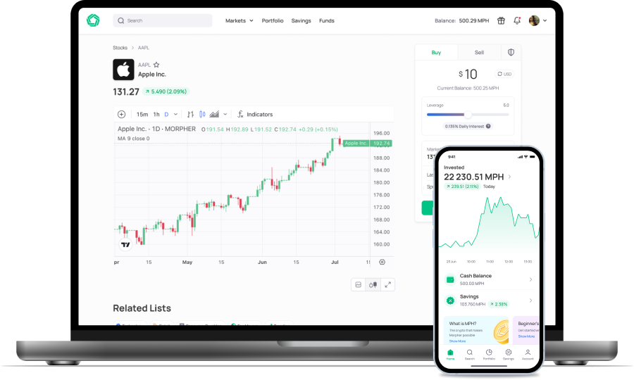
Ready to put your newfound knowledge of Bitcoin charts into action? Look no further than Morpher, the revolutionary trading platform that empowers you with zero fees, infinite liquidity, and the flexibility of fractional investing. Whether you're looking to trade cryptocurrencies, stocks, forex, or dive into the world of NFTs and more, Morpher offers a unique trading experience tailored to the modern investor. Sign up now to experience the future of trading and receive your free sign-up bonus. Your journey to mastering the markets begins with Morpher.

Disclaimer: All investments involve risk, and the past performance of a security, industry, sector, market, financial product, trading strategy, or individual’s trading does not guarantee future results or returns. Investors are fully responsible for any investment decisions they make. Such decisions should be based solely on an evaluation of their financial circumstances, investment objectives, risk tolerance, and liquidity needs. This post does not constitute investment advice.

Painless trading for everyone
Hundreds of markets all in one place - Apple, Bitcoin, Gold, Watches, NFTs, Sneakers and so much more.

Painless trading for everyone
Hundreds of markets all in one place - Apple, Bitcoin, Gold, Watches, NFTs, Sneakers and so much more.


