Article Contents
ABCD Pattern: Trading Rules & Examples
Asset prices never move in a straight line. In a bull market, an asset will make impulsive moves to the upside, followed by brief periods of retracement. The price rallies, and then the price retraces. The latter move is called a pullback.
This type of price action signals a healthy trend, and typically, pullbacks have a short duration before the market begins trending upwards again. When the market ranges between support and resistance without breaking out, it's known as a consolidation phase.
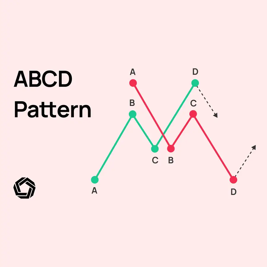
So, we traders know that after a projected trend, the market tends to change direction. The ABCD formation aims to identify the second pullback of a trend. This is the point when the trend could lose strength and reverse. In other words, it looks for a short-selling opportunity during a rising market and a buying opportunity during a falling market. Although such behaviour goes against the classic trader wisdom of “the trend is your friend,” it aligns with the human instinct to buy when the price has fallen.
The ABCD formation is easy to understand, and some traders even consider it reliable, as the calculation is based on Fibonacci levels. The formation consists of:
- The initial movement or trend (AB).
- The reversal (BC).
- The expected new trend (CD).
In this article, we will show you all there is to know about this pattern, from formations to rules on when to trade it. And as you know, in our articles, we give you strategy ideas and clear examples on the charts, so let’s get right into the ABC’s.
How to Identify the ABCD Pattern
The ABCD Pattern can be categorized into two primary variants: Bullish ABCD and Bearish ABCD.
Bullish ABCD Pattern
This formation typically emerges in chart analyses and indicates either a bullish trend reversal or continuation.
- Initial Leg (AB):
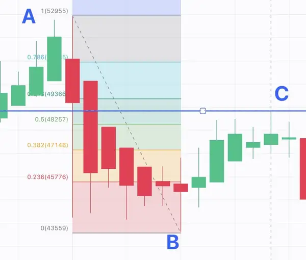
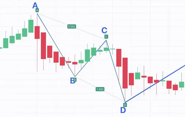
Seek a prominent downtrend where the price transitions from point A to B. Start by identifying a significant price move on your chart, which will be labelled as the AB leg. Now, point C should be within the AB leg. Use the Fibonacci retracement tool on your charting platform to plot retracement levels. Begin the tool at point A and end it at point B. In an ideal pattern, Point C should be around 61.8% and 78.6% of AB. However, during strongly trending market it can also be within the 38.2% and 78.6% levels. As you can see here, point C is around 58% falling into the pattern.
- Retracement (BC):
After the BC retracement, the price trend should ascend again. As we already established, the ideal retracement would be within the levels of 61.8% and 78.6% for point C. If the BC leg ends (or finds support/resistance) at the 61.8% or 78.6% retracement level, it can indicate that the ABCD pattern is forming as anticipated.
- Extension (CD):
Following the BC retracement, a decline in the price is expected, defining point D. Point D should be around 127% and 161% of BC. Again, these would be the ideal points for an ABCD pattern; in strongly trending markets, point D can also be a bit outside of the norm.
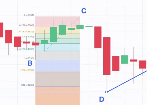
For example, in the hypothetical case of stock XYZ, with a start price of $40, an ascent from $40 (A) to $60 (B) is noticed. A BC retracement lowers the stock to $52 (C). The price then rises, marking $68 (D).
Bearish ABCD Pattern (A special case with a strong trend)
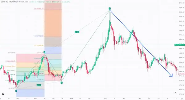
This pattern is essentially the antithesis of the Bullish ABCD, suggesting a likely reversal or prolongation of a downward trend. This chart will show you a special case where a strongly trending market prolonged the CD leg.
- Initial Leg (AB):
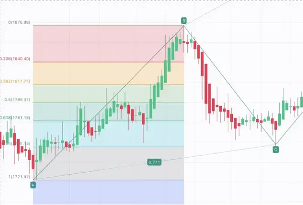
Discern a pronounced downtrend, with the price migrating from A to B. Seek a prominent upward trend where the price transitions from point A to B. Start by identifying a significant price move on your chart, which will be labelled as the AB leg. Now, point C should be within the AB leg. Use the Fibonacci retracement tool on your charting platform to plot retracement levels. Begin the tool at point A and end it at point B. In an ideal pattern, Point C should be around 61.8% and 78.6% of AB. In our case, it is perfectly aligned with the Fibonacci levels.
- Retracement (BC):
Post identifying the AB leg, ascertain the retracement's span from B to C. After the BC retracement, the price trend should increase again. As we already established, the ideal retracement would be within the levels of 61.8% and 78.6% for point C. If the BC leg ends (or finds support/resistance) at the 61.8% or 78.6% retracement level, it can indicate that the ABCD pattern is forming as anticipated.
- Extension (CD):
Following the BC retracement, an uptrend in the price is expected, defining point D. In this special case, the uptrend is holding on for a prolonged period. That is also why the ABCD pattern is not forming an ideal formation. In cases like this, where you can see a trend going on without any signs of reversal, keep following it and look for potential indications when the trend might stop. As we said, in strongly trending markets, such as this example, it is acceptable that the pattern might not be ideal.
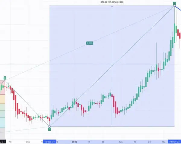
For example, when taking stock ABC as an illustration, a decline from $100 (A) to $60 (B) is observed. A BC retracement increases the value to $68 (C). The subsequent fall takes it to $52 (D). The differences in B and C can provide insights into potential price directions.
ABCD Pattern Criteria
- The AB trajectory should exhibit a notable price alteration, denoting a robust trend.
- In an ‘ideal' ABCD, the BC line should be 61.8% or 78.6% of AB. So, if you use your Fibonacci retracement tool on the initial move from A to B, BC should end at the 61.8 or 78.6 level. Exceeding this might imply a potential pattern inconsistency.
- Similarly, CD should be around 127% and 161% of BC. In strongly trending markets, these measurements do not have to be precisely correct.
- Ideally, the AB is as long as CD. In a perfect world, it would have the same amount of candles and the same decline in percent.
- Point D's alignment with other technical pointers can enhance the reliability of the pattern.
- Complementing the ABCD pattern with other technical instruments can elevate the likelihood of sound trading decisions.
In conclusion, the ABCD pattern is a reliable tool for forecasting price shifts. However, combining it with other technical metrics is pivotal for effective decision-making.
How to Trade the ABCD Pattern
Bullish ABCD Pattern with Bollinger Bands
Obviously, imagining a specific pattern without seeing it in the charts is always difficult, so we always prepare some real-world examples. In this case, it is all about four pivotal points—A, B, C, and D—each marking significant swing highs or lows on the price chart. Connecting these dots with trendlines unveils the essence of the ABCD pattern. Let us go through an example on the Tesla Chart.
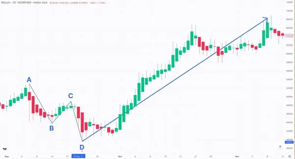
Let's decode the price journey on the chart above using the ABCD pattern while also using the Bollinger Bands indicator.
Our journey begins at point A, marked at 53,000, symbolizing a robust swing high. The ascent from A culminates as the price retraces to point B found at 43,400. Continuing the journey, the price regains strength, going to point C at 48,800. Notably, point C resides within the Fibonacci level between points A and B. The ensuing descent guides us to point D, situated at 39,400. This swing must dip below point B, solidifying itself as the ultimate point in the ABCD pattern. Point D could serve as a potential support level, cementing the ABCD sequence.
Then, we check if it is consistent with the pattern's Fibonacci levels. Point C should be around 61.8% and 78.6% of AB. In our setup, point C is almost at the 61.8% level. Point D should be about 127% and 161% of BC. In our setup, it is about at the 161% level.
We can use the ABCD Pattern tool to see the levels straight away, and we can see the exact levels. In our case, C is around 0.58 of AB, and D is about 1.68 of BC. It is important to note that the above 61.8% – 78.6% and 127% – 161% indicate an ideal pattern. In strongly trending markets, like the one we are looking at, it is totally normal that the pattern is deviating a bit.
Alternatively, you can draw the levels yourself with the Fibonacci tool.

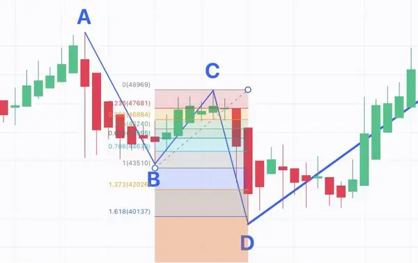
Now, we are pivoting towards our strategic manoeuvre—initiating a buy trade based on the ABCD pattern, fortified by insights from the Bollinger Bands indicator.
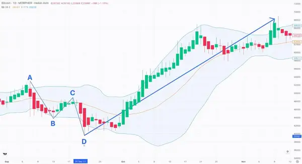
The Bollinger Bands encompass the middle band (a 20-day simple moving average in this context) and upper and lower bands set at two standard deviations away. These bands illuminate potential overbought and oversold zones.
In the present scenario, a conspicuous red candle that emerges outside the Bollinger Bands captures our attention. This event suggests a substantial deviation from the norm (indicated by the orange circle at point D), possibly signalling an overextension. In response, we envisage a potential regression to the mean.
Considering the ABCD pattern and the price's divergence from the Bollinger Bands, we strategically opt to execute a buy trade at point D (39,400). Our rationale centres on D's plausible role as a support level within the pattern. The alignment of the ABCD pattern and the price surpassing the Bollinger Bands implies an impending shift in the ongoing price trend. This would have been a beautiful trade, going from 39400 to almost 68000, giving you a fantastic profit.
Nevertheless, it's imperative to underscore the significance of comprehensive decision-making. Trading choices should never hinge solely on a solitary pattern or indicator. Factors such as trading volume, the prevailing trend direction, and the broader market landscape should invariably inform your trading strategies.
Bearish ABCD Pattern with RSI and Tweezer Tops Pattern
For this scenario, we have the subsequent points mapped out for the ABCD pattern on the GOLD chart.
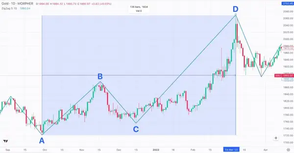
Let's methodically break down the analysis. We start at A, which is around 1700. This marks the genesis of the ABCD pattern, portraying a notable swing low. It signals the end of a bearish movement in GOLD's price.
After the bearish stint from A, the price retraces its steps to point B, around B 1880. Point B embodies a swing high, potentially serving as a resistance barrier. Theoretically, we might have also opened a short position here, as the RSI clearly shows above 70, meaning the market is overbought.
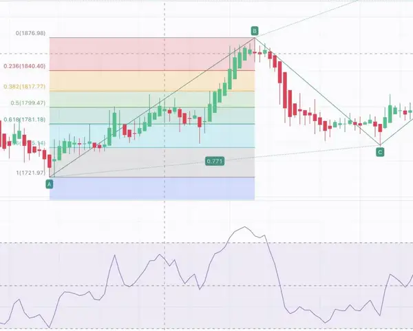
Extending from point B, the price renews its downward trajectory and shapes another swing low at C, which is around 1755. Positioned typically higher than point A but lower than point B, C takes on the role of a new support level. Here, we start checking for the Fibonacci levels, and the first one comes in perfectly at around 77%. So, this is a very strong indication that an ABCD pattern is forming.

Following the journey from C, the price rallies anew and materializes at point D. This swing high usually outshines point B and consummates the ABCD pattern. Point D emerges as a conceivable level of resistance at 2050. Here comes the exciting part, as point D outshines point B quite heavily. Typically, this would not clearly constitute an ABCD pattern as the Fibonacci Levels for point D are not within the bounds. However, you can trade the pattern in cases such as this one, where you have a strongly trending market with almost 30 consecutive Heikin Ashi candles. Just be very careful when trading it to wait for the correct reversal once the trend stops. That is why it is crucial to use other indicators and patterns in combination and not solely rely on one indicator.
Now, let's proceed to your strategic choice—to sell. Our assumption is grounded in the peak formation, the RSI indicator, and the tweezer tops pattern.
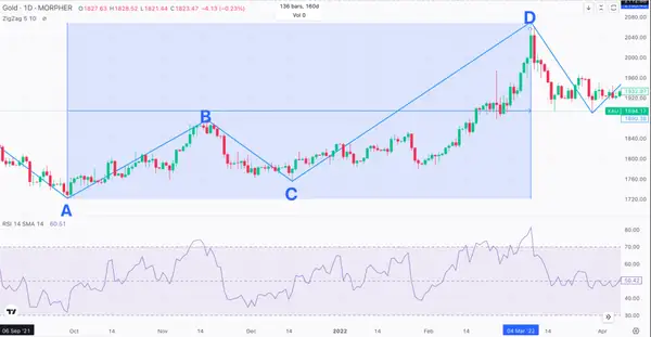
The peak formation hints at the price attaining a substantial zenith, possibly beckoning a reversal. The RSI (Relative Strength Index) reading above 80 also signals overbought territory and signalling a sell prospect. Above 80 is already a solid sign of an overbought market.
Furthermore, a tweezer top pattern is showing—a candlestick pattern where two successive candlesticks showcase similar highs, insinuating a plausible alteration in the price trend. The recognition of this pattern amplifies the conviction in assuming a short position.
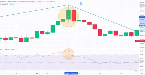
So we are taking the short from around 2050 to around 1890, giving us a bit less than 10% profit.
It's paramount to remember that trading verdicts ought not to hinge exclusively on a solitary pattern or indicator. Before embarking on a trade, It is vital to consider other variables, encompassing volume, trend direction, and the overarching market landscape.
Conclusion
Let's highlight the significance of combining the ABCD pattern analysis with other tools in wrapping up. Imagine it like solving a puzzle—when we put different pieces together, we get a clearer picture.
Like how a detective gathers clues from various sources to solve a mystery, we, as traders, should use different tools to make smarter decisions. The ABCD pattern gives us a helpful roadmap, showing potential turns in prices. But, to ensure we're on the right track, we need more clues.
Other tools, like the RSI indicator or other candlestick patterns for entry and exit, can give us extra hints. Combining the ABCD pattern analysis with other tools is like using teamwork to make better choices. Remember, the more clues we gather, the clearer our trading path becomes.

Disclaimer: All investments involve risk, and the past performance of a security, industry, sector, market, financial product, trading strategy, or individual’s trading does not guarantee future results or returns. Investors are fully responsible for any investment decisions they make. Such decisions should be based solely on an evaluation of their financial circumstances, investment objectives, risk tolerance, and liquidity needs. This post does not constitute investment advice.

Painless trading for everyone
Hundreds of markets all in one place - Apple, Bitcoin, Gold, Watches, NFTs, Sneakers and so much more.

Painless trading for everyone
Hundreds of markets all in one place - Apple, Bitcoin, Gold, Watches, NFTs, Sneakers and so much more.
