Best Indicators for Swing Trading
Swing trading is a trading style where traders aim to capture gains from an asset's price movements over a period of a few days to several weeks. Successful swing traders use technical indicators to identify potential buy low and sell high signals.
Indicators are technical analysis tools that provide valuable information about market trends, momentum, and potential price movements. They help swing traders identify key entry and exit points, as well as trend reversal or market turning point signals.
This article will discuss various technical indicators commonly used by swing traders. It will focus on trend-following indicators, which identify the direction of a trend, and momentum indicators, which measure the strength of a trend.
Swing Trading Indicators
There are many types of indicators that successful swing traders rely upon.
Trend Indicators
For example, trend indicators are technical analysis tools that identify market directions and strengths. Trend indicators work by analyzing price data and identifying patterns or trends in the market.
Oscillators
Oscillators identify potential market turning points and measure market momentum. They work by analyzing an asset's price and volume data and providing traders with a reading that oscillates between two extremes, typically zero and 100.
Volume Indicators
Volume indicators measure the strength of buying or selling pressure in the market. They analyze an asset's trading volume or the total number of shares or contracts that have been traded over a specified period of time.
Volatility Indicators
Volatility indicators measure the amount of price variation or volatility in the market. These indicators are beneficial to swing traders, who are looking to capture gains from an asset's price movements over a period of a few days to several weeks.
Best Indicators for Swing Trading
Trend Indicators
Three trend indicators, along with illustrative examples, are described below.
Parabolic SAR
The Parabolic SAR (“Stop And Reverse”) identifies potential trend reversals and provides trailing stop-loss levels for open positions. It consists of a series of dots that are positioned above or below the candlesticks. An example Bitcoin candlestick chart along with blue Parabolic SAR dots is illustrated below.
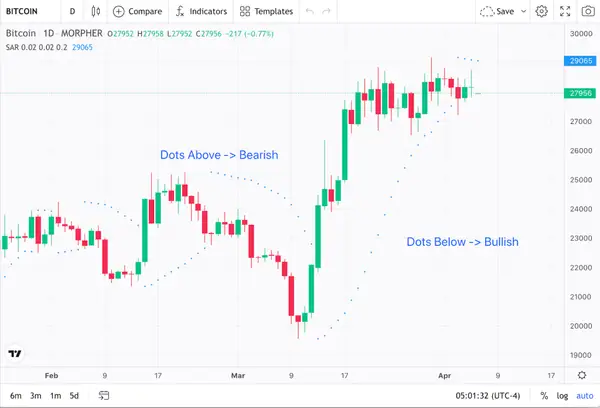
Bitcoin 1-Day Price Chart and Parabolic SAR Indicator (source: Morpher.com)
A bearish trend is signaled with blue dots above the price bars. Blue dots below the price bars signal a bullish trend.
SAR can be computed via the following:
SARn = SAR(n-1) + AF x (EP – SARn-1)
Where SARn is the current value of the Parabolic SAR, SAR(n-1) is the previous SAR value, AF is the Acceleration Factor, and EP is the Extreme Point (the highest high or lowest low) of the current trend.
The AF starts at 0.02 and increases by 0.02 each time a new high or a new low is reached. The maximum value of the AF is typically set at 0.20.
The Parabolic SAR can be used to identify potential trend reversals, as a change in the position of the dots can signal a shift in the direction of the trend.
Supertrend
The Supertrend indicator is based on the concept of ATR (Average True Range) and uses the ATR to calculate the indicator values.
The Supertrend consists of two lines. A Supertrend line is used to indicate the current trend direction, while the Signal line is used to indicate potential trend reversals.
The Supertrend line is calculated using the following formula:
Upperband = (High + Low) / 2 + Multiplier * ATR
Lowerband = (High + Low) / 2 – Multiplier * ATR
Supertrend = IF (Close <= Supertrend_prev AND Prev_Trend = 1, Upperband, IF(Close >= Supertrend_prev AND Prev_Trend = -1, Lowerband, Supertrend_prev))
Where High, Low, and Close are the high, low, and closing prices of the asset, respectively.
The ATR is the average true range, the Multiplier is a parameter that determines the sensitivity of the indicator, and the Supertrend_prev is the previous value of the Supertrend. The Prev_Trend is the previous trend direction, which can either be bullish or bearish.
The Signal line is calculated using a moving average of the Supertrend line over a specified period of time. The Signal line can be used to confirm potential trend reversals indicated by the Supertrend line.
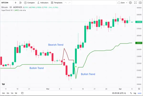
Bitcoin 1-Day Price Chart and Supertrend Indicator (source: Morpher.com)
This indicator can be used to identify the current trend direction. A bullish trend is indicated by the Supertrend green line residing below the candlesticks.
Alternatively, a bearish trend (noted in red) is indicated by the Supertrend red line residing above the candlesticks.
ADX (Average Directional Index)
The Average Directional Index (ADX) measures the strength of a market trend, whether that trend is an uptrend or a downtrend.
The ADX is calculated using a formula that takes into account the difference between two Directional Movement Indicators (DMI): the positive Directional Indicator (+DI) and the negative Directional Indicator (-DI). The ADX value ranges from 0 to 100, with a higher value indicating a stronger trend.
For example, when the ADX value is below 25, it usually indicates a weak or sideways trend, and swing traders may prefer to wait for a stronger trend before taking a position.
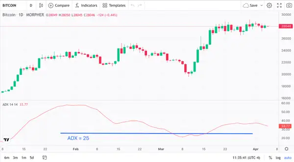
Bitcoin 1-Day Price Chart and ADX Indicator (source: Morpher.com)
When the ADX value is above 25 (as of March 15 in the Bitcoin chart above), it usually indicates a strong trend, and swing traders may consider entering a trade in the direction of the trend.
Best Oscillators for Swing Trading
Three oscillator indicators, along with illustrative examples, are described below.
Relative Strength Index (RSI)
The Relative Strength Index (RSI) measures the strength of an asset's price movement over a certain amount of time.
A formula for calculating the RSI takes into account the average gains and losses in an asset's price over a predetermined number of periods. A higher or lower RSI value indicates a stronger uptrend, while a higher or lower RSI value indicates a weaker downtrend.
When the RSI value is higher than 70, it usually means that an asset is overbought as noted in the Bitcoin price chart below. This means that the price of Bitcoin has gone up too much and too quickly, and it might be time for a correction. In this instance, swing traders might think about selling Bitcoin or shorting it.
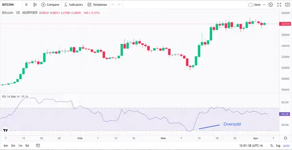
Bitcoin 1-Day Price Chart and RSI Indicator (source: Morpher.com)
An asset is oversold when its RSI value falls below 30 as noted in the Bitcoin price chart above. This indicates that its price has fallen too rapidly and may be due for a rebound.
Stochastic Oscillator
The Stochastic Oscillator measures the momentum of an asset's price movements. Specifically, it compares the closing price of an asset to its price range over a specified period of time.
It uses two lines. The %K line represents the current price level in relation to the asset's price range over a specified period of time. The %D line is a moving average of the %K line.
The Stochastic Oscillator is scaled from 0 to 100 and generates signals based on overbought and oversold levels. An example Bitcoin price chart with a Stochastic Oscillator is illustrated below.
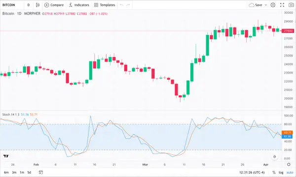
Bitcoin 1-Day Price Chart and Stochastic Oscillator Indicator (source: Morpher.com)
As illustrated, when the %K line (illustrated in blue) crosses above the %D line (orange line) and then rises above the 80 level (late January), Bitcoin is considered overbought, which may signal a potential sell signal.
Conversely, when the %K line crosses below the %D line and falls below the 20 level, Bitcoin is considered oversold, which may signal a potential buy signal. This appears to be what happened shortly after March 6 where the %K line crosses below the %D line and falls below the 20 level, wherein Bitcoin went on a bit of a bullish run.
Commodity Channel Index (CCI)
The Commodity Channel Index (CCI) measures the momentum of price fluctuations. Specifically, it measures the difference between the current price of an asset and its average price over a specific period.
It then normalizes this difference by dividing it by the mean absolute deviation of the asset's price from its average price. This normalization helps to reduce the impact of outliers or extreme values in the data set.
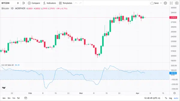
Bitcoin 1-Day Price Chart and CCI Indicator (source: Morpher.com)
The resulting value of the CCI oscillates between +100 and -100, with readings above +100 indicating overbought conditions, and readings below -100 indicating oversold conditions.
Note that when the CCI in the Bitcoin price chart illustrated above fell below -100 on March 14 indicating an oversold condition, Bitcoin subsequently went on a bit a bull run.
Best Volume Indicators for Swing Trading
Three volume indicators, along with illustrative examples, are described below.
On-Balance Volume (OBV)
On-Balance Volume (OBV) measures the cumulative buying and selling pressure in a financial market. It is based on the theory that the volume of trading activity can be a leading indicator of price movements.
The OBV indicator plots a line that shows the running total of volume for a specific asset. It adds the volume on up days and subtracts the volume on down days, resulting in a cumulative line. When prices rise, the OBV line also rises, indicating buying pressure, while when prices fall, the OBV line falls, indicating selling pressure.
An exemplary Bitcoin and OBV Indicator chart is illustrated below. Note how the upward trend in the OBV Indicator tracks the upward Bitcoin price as of March 9th.
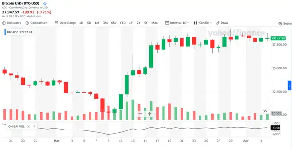
Bitcoin 1-Day Price Chart and OBV Indicator (source: Morpher.com)
Here, where the price of Bitcoin is increasing, and the OBV is also increasing, this suggests that there is strong buying pressure behind the trend.
Conversely, if the price of Bitcoin is decreasing, and the OBV is also decreasing, this suggests that there is strong selling pressure behind the trend.
Chaikin Money Flow (CMF)
Chaikin Money Flow (CMF) measures the amount of buying and selling pressure in a financial market. The CMF indicator uses both price and volume data to generate its signals. It measures the accumulation or distribution of an asset by comparing the closing price to the high and low range of the price for the day.
The resulting number is then multiplied by the volume for the day. The CMF line is then calculated by summing these values over a specified time period and dividing by the total volume over that period.
The CMF indicator provides information about the strength of buying or selling pressure in the market.
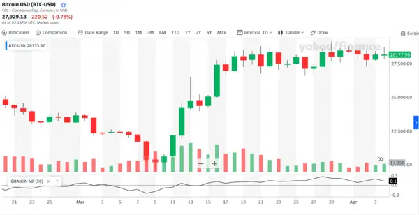
Bitcoin 1-Day Price Chart and CMF Indicator (source: Coinmarketcap.com)
For example, if the CMF line is above zero, it suggests that buying pressure is stronger than selling pressure, indicating bullish sentiment. Note CMF breaking above 0 on March 11 leading to a Bitcoin bull run.
Conversely, if the CMF line is below zero (which occurred on March 3), it suggests that selling pressure is stronger than buying pressure, indicating a bearish sentiment in the Bitcoin market.
Money Flow Index (MFI)
The Money Flow Index (MFI) is a momentum indicator that uses both price and volume data to identify whether a stock is overbought or oversold.
The MFI calculation involves several steps:
- Calculate the typical price for each period: (high + low + close) / 3
- Calculate the money flow for each period: typical price x volume
- Divide the periods into those with Positive Money Flow (PMF) and those with Negative Money Flow (NMF)
- Calculate the Money Ratio (MR): PMF / NMF
- Calculate the MFI: 100 – (100 / (1 + MR))
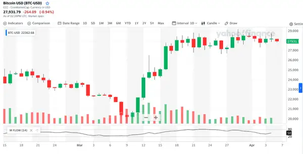
Bitcoin 1-Day Price Chart and MFI Indicator (source: Coinmarketcap.com)
The MFI oscillates between 0 and 100 and is considered overbought above 80 and oversold below 20.
Best Volatility Indicators for Swing Trading
Bollinger Bands
Bollinger Bands measure volatility and identify potential price trends in financial markets and consist of three lines plotted on a price chart.
The first line is the middle band, which is typically a Simple Moving Average (SMA) over a certain number of periods. The second line is the Upper Standard Deviation and represents the highest expected price within the given time period.
The Lower Standard Deviation is the lower band and represents the lowest expected price within the given time period.
An illustration of the Bollinger Bands for a typical Bitcoin price chart can be found below.
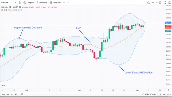
Bitcoin 1-Day Price Chart and Bollinger Bands Indicator (source: Morpher.com)
As illustrated, the upper and lower blue Bollinger Bands form a channel around Bitcoin’s SMA, which is the middle orange band. As the price of Bitcoin moves up and down, the Bollinger Bands expand and contract accordingly.
Average True Range (ATR)
The Average True Range (ATR) measures the volatility of an asset by calculating the average range of price movements over a specified time period.
The true range is the greatest of the following:
- The difference between the high and low of the current period.
- The difference between the high of the current period and the close of the previous period.
- The difference between the low of the current period and the close of the previous period.
The ATR is plotted as a line on the chart and is used to identify potential trend reversals and to set stop loss levels.
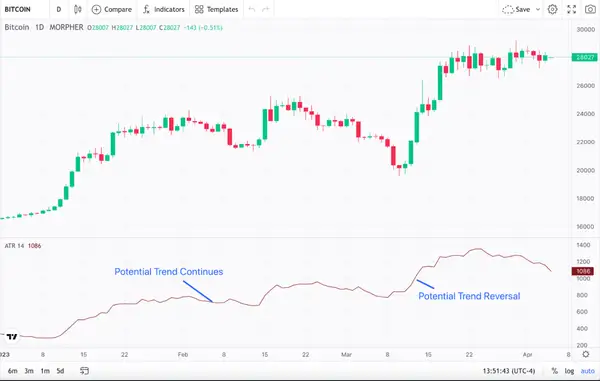
Bitcoin 1-Day Price Chart and ATR Indicator (source: Morpher.com)
Swing traders can use the ATR to identify potential trend reversals. When the ATR is rising, it suggests that volatility is increasing, which signals a potential trend reversal as noted above.
Conversely, when the ATR is falling, it suggests that volatility is decreasing, which indicates that the current trend may continue as also noted above.
Standard Deviation
The Standard Deviation (SD) measures how much an asset's price deviates from its average price. The SD indicator is calculated by taking the difference between an asset's price and its moving average, and then squaring that difference. The squared differences are then added together, divided by the number of observations, and then square-rooted to find the SD.
As illustrated in the Bitcoin chart below, the SD indicator is plotted as a line on the chart.

Bitcoin 1-Day Price Chart and SD Indicator (source: Morpher.com)
Swing traders can use the SD to identify potential trend reversals. When the SD is rising, it suggests that volatility is increasing. This could signal a potential trend reversal which is what appears to have happened to Bitcoin in early November.
Conversely, when the SD is falling as also noted above, it suggests that volatility is decreasing. This may indicate that the current trend may continue.
More Reliable Indicators
Moving Averages
A moving average indicator is used to smooth out fluctuations in asset prices. It calculates the average price over a specified period, with the most common being 50, 100, and 200 days. The calculation is made by taking the sum of the closing prices over the specified period and dividing by the number of periods.
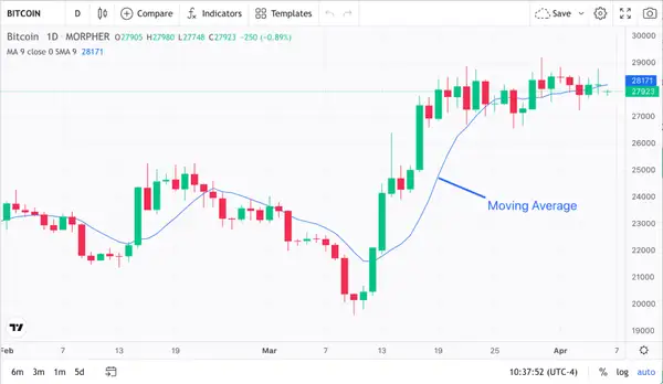
Bitcoin 1-Day Price Chart and Moving Average Indicator (source: Morpher.com)
The moving average (noted in blue above) can be plotted alongside Bitcoin's price, and helps to identify trends and potential trading opportunities. If Bitcoin’s price is trading above the moving average, it suggests a bullish trend. Otherwise, it suggests a bearish trend.
Keltner Channels
Keltner Channels are used to identify potential price reversals. This indicator consists of three lines, with a centerline being a moving average, and two outer lines drawn based on the asset’s volatility.
The following may be used to compute the Keltner Channel Indicator:
Upper Band = Moving Average + (Multiplier x ATR)
Lower Band = Moving Average – (Multiplier x ATR)
Where:
- The Moving Average is the typical price average over a period of time.
- The Multiplier is the number of Average True Range (ATR) units above and below the moving average line.
- ATR is a volatility indicator that measures the range of an asset’s price movement over a specific time period.
The upper band represents the asset’s highest price, while the lower band represents the lowest price. The area between the upper and lower bands is known as the Keltner Channel. A representative Bitcoin price chart and Keltner Channel indicator is provided below.
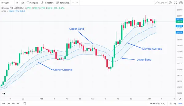
Bitcoin 1-Day Price Chart and Keltner Channel Indicator (source: Morpher.com)
When an asset’s price reaches the upper band, it is considered overbought, and a swing trader might look for a potential price reversal. And when an asset’s price reaches the lower band, it is considered oversold.
Heikin-Ashi Candles
The Heikin-Ashi candlestick technique uses a modified formula to calculate the open, high, low, and close of each candle. This results in smoother-looking candles and provides a clearer picture of a security’s trend.
In a Heikin-Ashi candle, the open is calculated by taking the average of the previous candle’s open and close, while the high and low are calculated using the highest and lowest price in the current period. The close is the average of the open, high, low, and close of the current candle.
Swing traders can use Heikin-Ashi candles to identify a series of bullish or bearish candles to determine trend direction. As illustrated below, if there are multiple bullish candles in a row, it indicates a bullish trend. Multiple bearish candles in a row indicate a bearish trend.
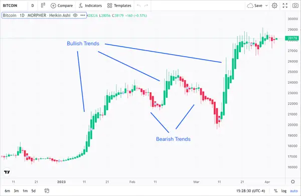
Bitcoin 1-Day Chart with Heikin-Ashi Candles (source: Morpher.com)
What Other Tools Do Swing Traders Use?
Support and Resistance Lines
Resistance and support levels identify potential price levels where a stock is likely to face resistance or support, respectively. A resistance level is a price level at which a stock has previously struggled to break through, while a support level is a price level at which a stock has previously struggled to fall below.
Resistance levels are often created when sellers enter the market and start selling shares, leading to a price ceiling where buyers are no longer willing to pay more for the stock. Support levels are often created when buyers enter the market and start buying shares, leading to a price floor where sellers are no longer willing to sell the stock for less.
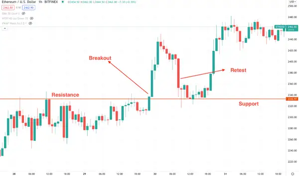
Ethereum 1-hour price chart with Resistance and Support Levels (source:Bifinex)
Note the common resistance and support levels designated in the Ethereum price chart above. When Ethereum breaks through this resistance level, it is called a breakout. Breakouts are typically accompanied by high volume and can be a signal that a stock is experiencing bullish momentum.
However, it's important to note that breakouts can sometimes be false signals, and Ethereum may fail to sustain its upward momentum. Therefore, some traders may wait for a retest before buying Ethereum. A retest occurs when Ethereum pulls back and retests the previous resistance level, which now acts as a support level. If Ethereum bounces off the support level and starts moving higher again (which it did in the example provided above), it may be a stronger signal that the breakout is indeed valid.
Candlestick Patterns
A candlestick chart is made up of a series of candlesticks, each representing a specific period of time (e.g., one hour, one day, or one week). The chart below is a Bitcoin 1-day candlestick chart.
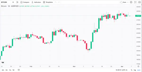
Bitcoin 1-day Candlestick Chart (source: Morpher.com)
The body of each candlestick represents the opening and closing prices for the day. The shadows (“wicks”) represent the high and low prices during that same period.
A bullish (or “green”) candlestick denotes that the closing price was higher than the opening price. A bearish (or “red”) candlestick denotes that the closing price was lower than the opening price.
Candlestick patterns can provide valuable information about the strength and direction of market trends. Some popular patterns include the morning and evening star patterns, hammer, pin bar, engulfing pattern, or tweezer pattern. Traders use these patterns in combination with other technical indicators to make trading decisions and identify potential entry and exit points.
Conclusion
Indicators can be beneficial to swing traders by providing them with an indication of the direction and strength of market trends. By using these indicators, traders can make more informed trading decisions, identify potential buy or sell signals and set appropriate risk management strategies. However, it is important to remember that indicators should be used in conjunction with other forms of technical analysis and should not be relied on as the sole basis for making trading decisions.

Disclaimer: All investments involve risk, and the past performance of a security, industry, sector, market, financial product, trading strategy, or individual’s trading does not guarantee future results or returns. Investors are fully responsible for any investment decisions they make. Such decisions should be based solely on an evaluation of their financial circumstances, investment objectives, risk tolerance, and liquidity needs. This post does not constitute investment advice.

Painless trading for everyone
Hundreds of markets all in one place - Apple, Bitcoin, Gold, Watches, NFTs, Sneakers and so much more.

Painless trading for everyone
Hundreds of markets all in one place - Apple, Bitcoin, Gold, Watches, NFTs, Sneakers and so much more.
